Tips and Tricks For The Author/Artist Collaboration
By: Jamie Schumacher
Before I fully stepped into my writing path, I imagined it as a solitary journey. Hunched over my desk, staring at the screen, mentally magnetized to the words on the page.
Wait, actually, yeah- it is like that a little bit.
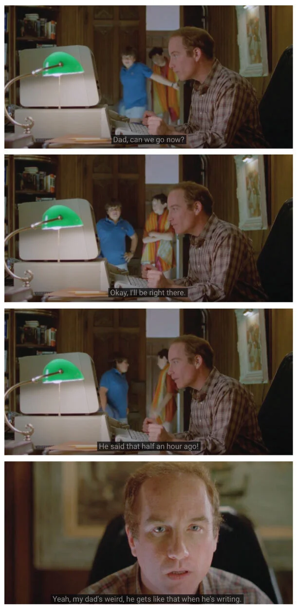
(me, as prophesied in the 1986 classic Stand By Me.)
But writing is also incredibly collaborative! More so than I ever would have imagined.
I worked closely with artists on both of my two books, and each process was a little bit different. My history of working with artists goes back further than my writing, though. I am an artist as well and ran a gallery for over a decade - collaborating with others on group projects and efforts.
There’s no right way or wrong way to collaborate (okay-maybe a few wrong ways) but there are some things I would advise to help make the process smoother for both authors and artists. In this post, I’ll talk a little bit about the visual side of the writing process, and give some tips for folks when working with artists on a literary project.
Book 1: It’s Never Going To Work: A Tale of Art and Nonprofits in the Minneapolis Community
How can somebody write a book about a gallery and arts district without pictures? I was pretty sure you couldn’t, and worked closely with my friend Athena Currier to illustrate and design my first self-published effort. After my manuscript was completed, I compiled archive images from the gallery’s history and worked with Athena to sort them into two categories: some to illustrate and some to present as-is.
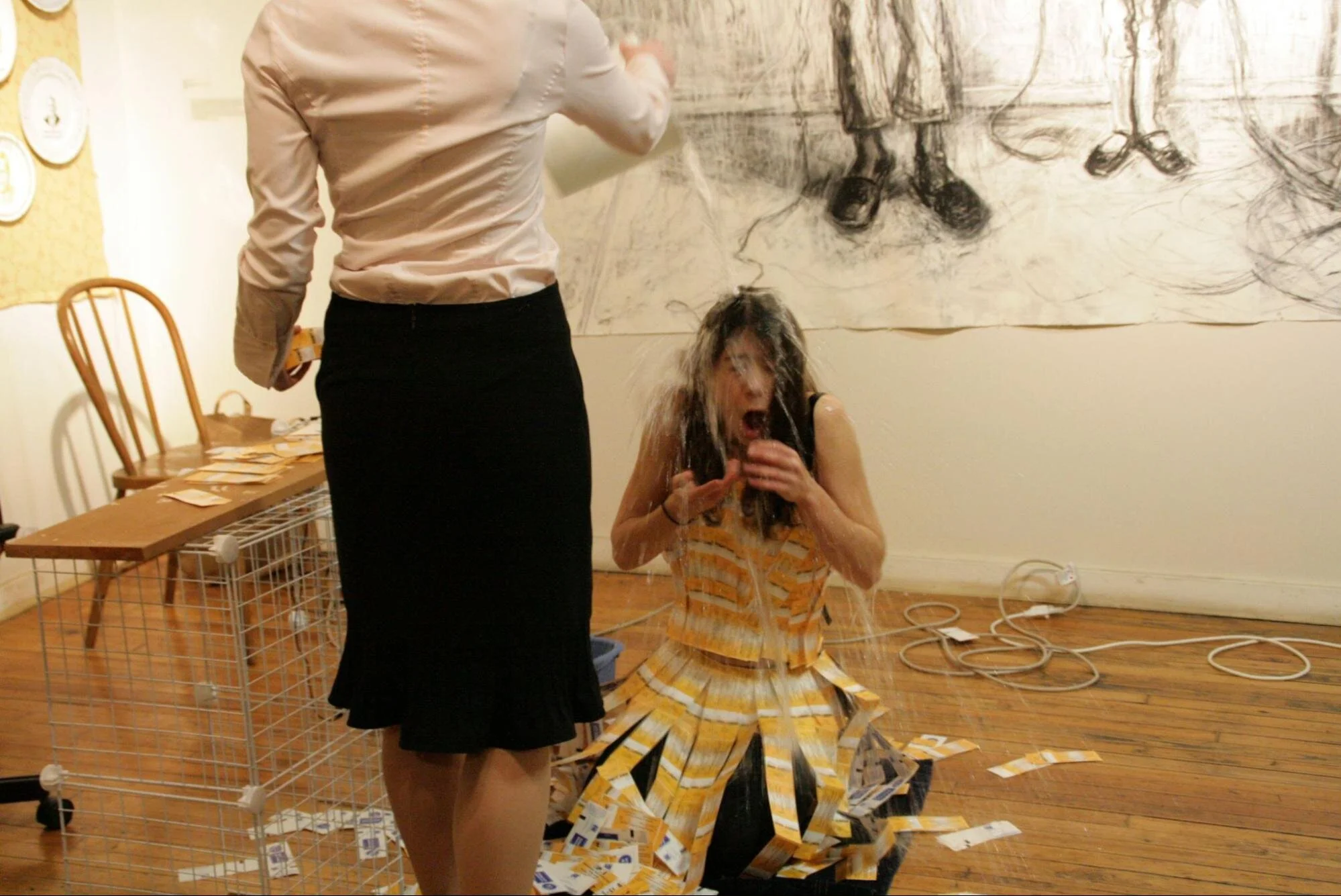
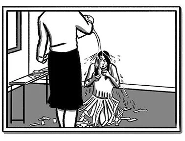
Athena then began the process of illustrating 25 images for inclusion with the text. The photos that remained would be presented as-is or in a small illustrated frame, which would create harmony. For additional visual perks, Athena added small flourishes between chapters like bricks, with a brick wall at each major section of the text that grew higher as the story progressed.
Original image, photo by Noelle Pierce for Ellen Mueller’s “Nor Any Drop to Drink” Anxiety Dreams performance.
Athena Currier’s Illustration
The results were awesome, and added personality and character to the book that would have been hard if not impossible to duplicate with written language alone.
For It’s Never Going To Work’s cover, I didn’t have a predetermined vision for it. In cases like this, it’s common for the designer to provide a few options to choose from. Athena drafted four cover versions for me, all of which were so great it was hard to choose!
We ended up going with the last option with a modified subtitle, in large part because the bright, bold cover stood out to me and simply felt right.
For the book release event, I printed a collage of Athena’s illustrations to include on display, along with other artwork from regular gallery artists. When we held the release party at a local bookstore, it was lovely to have the added visual elements to the evening.
Working with Athena added a layer of joy to the effort - not to mention it was great to work with a friend on a creative collaboration!
Book #2: Butterflies and Tall Bikes
Original reference photo of my friends Mary Laurel True and Eunice Eckerly
Nothing like a pandemic anxiety project to mix up the process! My second book was written as I both transitioned into a new job and fielded the chaos that came with the the throes of 2020. At home with two young kids literally 24/7, a creative outlet post-bedtime was my saving grace. The visual aspect to this project rolled out a bit differently and more iteratively than the first, however.
Concept sketch for book illustrations
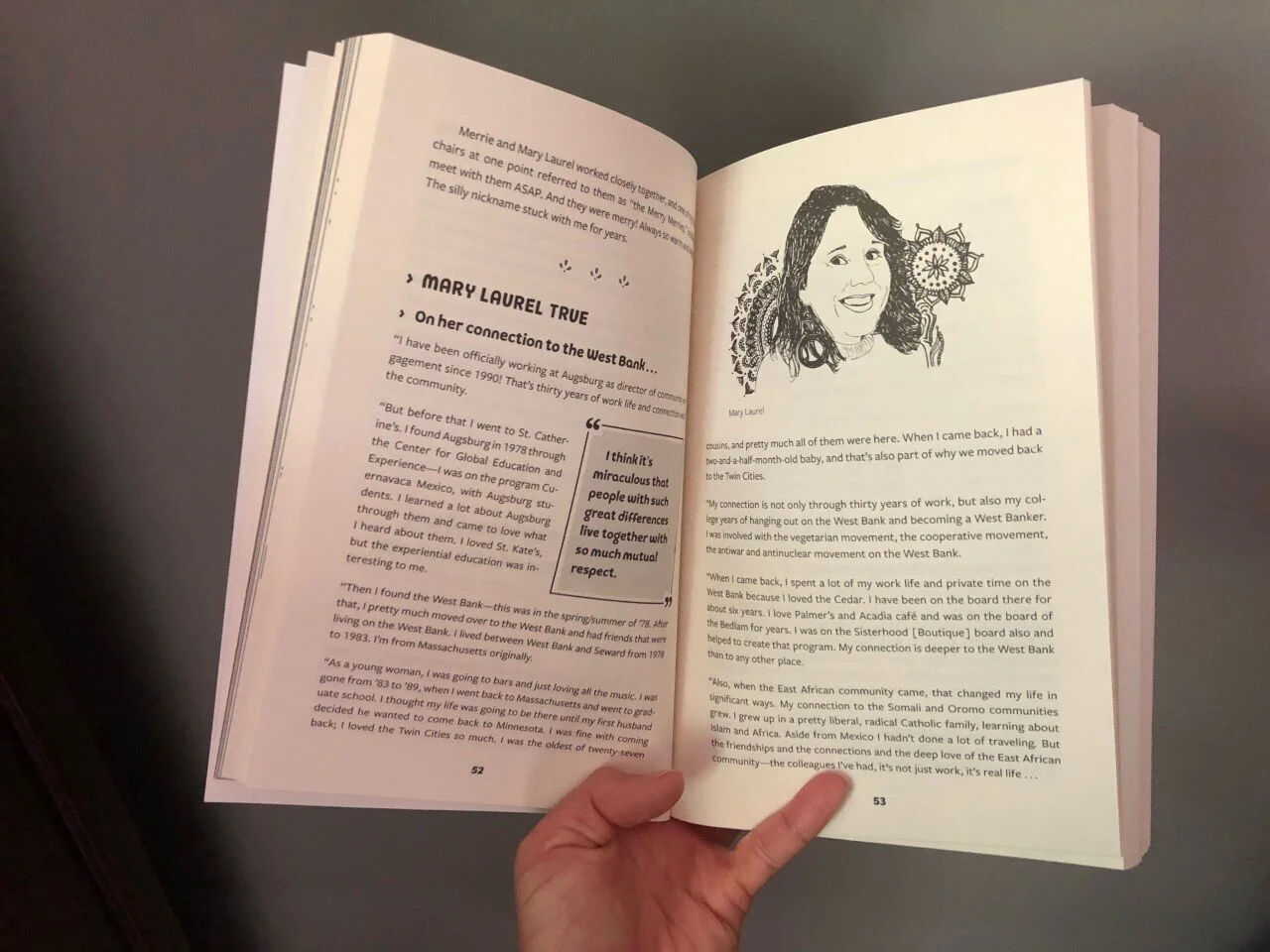
Corina’s final illustration in the book.
In 2020, I found a critical salve in writing, and wrote my second book Butterflies and Tall Bikes. For this effort I interviewed several dozen leaders, residents, and artists from the West Bank / Cedar-Riverside neighborhood where I spent the past decade working.
For this narrative nonfiction effort, I worked with my niece Corina Sagun to complete the illustrations as I wrote, rather than wait after I was done with the manuscript. A burgeoning artist, Corina took a few of my sample concepts and ran with the idea, flourishing illustrated portraits with her mandala-like patterns behind them. Rather than half photos and half drawings, I wanted this book to be mostly illustration. All-in-all Corina completed upwards of seventy drawings based on the reference photos I sent along. For this project, instead of waiting until they were all complete, she sent a few every couple days. The visuals gave me momentum and energy as I wrote, bursts of positive energy, at a time when positive energy was found in increasingly limited quantities. Seeing the illustrations was also helpful for me to visualize the story as a whole, as I was literally able to picture things as they drew together.
An idea for the cover image came to me as I wrote. In my book, one of the chapters leads in with an analogy of music to a neighborhood, not unlike a record of songs and music we grow to know and love. But who could complete the intricate buildings of the neighborhood? This was certainly beyond my own creative skillset. I sketched out a concept drawing which I sent to my friend Kevin Cannon, a tremendous illustrator who I worked with on several neighborhood maps I adored. He agreed to tackle the cover concept, as well as an internal map for the very neighborhood-specific book.
Basic concept illustration.
Absolute magic.
For the map, we established the boundary of the region we wanted to cover - relatively simple as the neighborhood has a very clearly defined boundary. With over 200 businesses and destinations, there was too much to include in one illustration. Based on the interviews and history within the book, I created a prioritized list of what to include and what would be nice, but not required. Kevin took this information and created one of his stunning, ever-enticing maps. I’ve seen it at least a hundred times now and I’m STILL noticing new things! Kevin even added several easter eggs throughout the map based on features from the interviews.
The third artist I worked with on this project was Ryan Scheife of Mayfly Designs. Ryan had a tall order: craft a design for the layout of the book that accentuated the style of two very different artists, Corina and Kevin, while not detracting from the quality of the text. After some font-testing and layout-testing, we settled on a beautiful font and page styling that stitched all the disparate elements together beautifully on the page.
I’m fortunate that I’ve been able to work with such great artists on these efforts, and am forever grateful for the creative contribution they added to my books. I’d love to see even more authors working with illustrators on their projects, and adding a visual element to their written efforts.
"What is the use of a book," thought Alice, "without pictures or conversations?"”
Some tips for working with artists on your project.
Either have a clear vision or open yourself to ideas. You don’t have to have the concept illustration in hand, but you do have to be willing to then work with an artist to help you visualize.
Provide samples. Any direction can be helpful for the artist you are working with. “I like covers that look like this.” or “I don’t care for photos on a cover, let’s go with something hand-drawn or designed.” And for illustrations, it helps to have an idea on what type of illustration you prefer too. This may be different for each project!
Give feedback, and try to be specific. There’s a difference between criticism and constructive criticism. Don’t like an illustration? Okay, but why. You will work with your artist to find that path together and it’s impossible for them to meet an invisible expectation.
Recognize that this will add time and cost to your project. Working with an artist is an investment, and it’s well worth it - but at the end of the day, it’s still an investment. Artists are worth compensating for the creative asset they will bring to your project, and I’ve never been in a situation where that wasn’t worthwhile. And give them enough time to do their work well.
Don’t force it.
Be clear about your own expectations, and any constraints you have. If you have a specific timeline or goal for your project, the artist your working with should be in the loop so they can help you meet your milestones.
Use tags in your manuscript, and be consistent with them. Knowing where to place images and which images to place is going to be necessary for your designer. You can use tags like this [[001.jpg IMAGE HERE]] for your designer to use as a map of what to place where. Let your designer know if placement is flexible or fixed, as sometimes illustrations won’t fit well on one page, but would look better a page ahead or behind.
Get comfortable sketching - even if it’s basic. Visuals can often communicate that it’s hard for words to do. Take my chicken-scratch sketch for the Butterflies and Tall Bikes cover. It doesn’t look like much, but it was super helpful to give Kevin a very clear direction for the cover of the book - which he manifested into his magical final.
And last but not least, APPRECIATE ARTISTS!
About the Author: Jamie Schumacher traded the beaches of California for the snowy lakeshores of Minnesota and works at the intersection of art, culture, and community development. As the director of the West Bank Business Association, Jamie helped secure Cedar-Riverside among Minneapolis’s city-designated cultural districts. She now works with LISC Twin Cities, alongside the cultural and creative districts of Minneapolis and St. Paul.
Her written work has been featured by Pollen, the Star Tribune, and MN Women’s Press. Her first book It’s Never Going to Work (2018) details the ups and downs of starting an arts nonprofit. Butterflies and Tall Bikes (2021)
Links:
Kevin Cannon: http://www.cannonmaps.com/prints/west-bank-map-11x14
Athena Currier: https://athenacurrier.com/
Corina Sagun: https://twitter.com/corina_sagun / https://www.corinasagun.com/
Ryan Scheife: https://mayflydesign.com/


